Jaime Fowler
Case Study
TravelZap Trip Type
Role: Product / UX Designer
Team: Camilo Pena, Sr. UI Designer
2024
Goal:
Determining if users will self-select and browse vacations based on the type of trip they are planning - i.e. Spring Break, family vacation, etc.

Target Audience:
Trip organizers planning group travel for 10 or more people, with trip purposes ranging from corporate retreats to bachelorette parties.
Challenges:
-
Wide range of reasons for group trips, each requiring unique travel accommodations.
-
Users are accustomed to traditional group booking methods, such as working with travel agents or using single-room booking platforms like Expedia.
-
Introducing a new and unfamiliar travel booking experience to users.


Trip organizer user personas
Research:
The first step of this project was to identify the most common reasons users were planning their group trips. To develop this list, I analyzed several years of historical business data, reviewing nearly 4,000 online request forms. This analysis allowed me to narrow the list to the most frequently mentioned trip purposes, providing us with a clear set of trip types to move forward with.


Data analysis
Competitor analysis:
From there, I did a competitor analysis to cross-reference what trip types are represented on other platforms. An important differentiation point to make here is that booking group trips online typically involves submitting an online form and hearing back from a travel agent. This common industry process made it very easy to identify common trip types used in the industry.


Competitor research
Design process:
The next step was to integrate the selected trip types into the browsing experience on the app’s homepage. The user experience needed to include:
-
Mobile-first design
-
Clear and prominent call to action
-
Intuitive interface
-
Ability for users to quickly identify the purpose of their trip
-
Standard travel booking inputs including travel dates
-
Clear communication that the app is dedicated to group travel
To achieve this, I chose to lead with a question prominently displayed on the home screen: "What type of group trip are you planning?" This question sets the stage immediately for users to know that this app is about planning a group trip while also planting the seed that they have the ability to identify the type of trip they are planning.
Below the call-to-action, a scrolling row of pill-shaped buttons showcases popular trip types, including an option for "other."
Next, users have the option to enter their travel dates and an estimated group size. The group size input reinforces the focus on group travel.
If a user does choose to select a trip type pill, they are rewarded with a curated list of recommended resorts tailored to the specific needs of that trip type.


Default load
Selected trip type
Results of initial test:
Once our trip type browse experience was launched I closely watched user sessions to determine if users would adopt this untraditional user flow or if we had strayed too far from Jakob's Law.
Our initial findings showed:
50%
of users selected
a trip type
42%
of users entered
travel dates
52%
of users entered
a group size
These results gave us the green light to move forward with iterating on this concept. Based on my observations of user behavior during this first test, I identified and prioritized addressing the following problems with the next iteration of the design:
The value of selecting a trip type was not apparent to users
I observed many users selecting different trip types and watching the page refresh multiple times before engaging further. We were curating recommendations based on trip type but the overall change to the page was very subtle and seemed to be missed by most users.
Our expertise in the travel industry was not clear to users
We were providing carefully selected recommendations by trip type but there was no way for a user to know why the recommendations were made or why they should trust our recommendations.
Users need the ability to change their trip type selection easily while browsing
One of the more surprising findings was that users commonly selected different trip types during a single user session. It was important to me to provide a seamless UX for this behavior in future designs.
User flow between the trip type pills, travel date, and group size works
A high percentage of users were interacting with all three CTAs immediately upon landing on the home screen. Since this flow was performing so well it was important to keep the integrity of this flow in future designs.
Design iteration:
The first thing on my mind when digging into our next iteration was how to add a highly visible, high value change to the home screen within the screen height constraints of mobile while not disrupting the high performing user flow between the trip type pills, travel dates, and group size inputs.
I also wanted to add copy that communicated our travel expertise, highlighted the reasons to book with us, and ultimately guided users to book their group trip with us

Screen height explorations

Iteration to include an image and additional copy with the three existing CTAs
Finding the visual balance to include all key elements within the screen height of our most common device size was critical. I carefully considered what information was most important and most impactful to have above the fold.
Early on, we discussed whether to include a large image in the header, even though it meant the first resort card would no longer be visible on the initial screen. I proposed including the image as a high-impact area that could be customized for each trip type. This approach not only created an obvious visual shift with each new selection but also allowed us to infuse the app with our brand identity. More importantly, it helped users visualize their vacation early in the shopping experience, setting an aspirational tone from the start.
To advance the trip type user experience even further, I designed a unique header for each trip type. Each header featured:
-
Custom headline crafted in the brand’s voice
-
Aspirational image to connect users to their future trip
-
Curated list of perks for booking with TravelZap, specific to the trip type
Other trip type

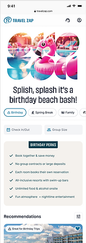
Birthday trip type

And in addition to the header design and perks box, I added a list of perks within the resort card for all of our recommended resorts. This list details why the resort has been chosen as a recommendation and allows for easy side-by-side comparison of the resorts.
Expanded resort cards to include resort specific perks
Final designs:
Our newly iterated design addressed all of the problems we identified during our initial phase.
The value of selecting a trip type was not apparent to users
Now when a user selects a trip type the page dramatically and visually adjusts to their selection - displaying a new image, new headline, new perks, and expanded resort cards for all recommended resorts.
Our expertise in the travel industry was not clear to users
Now the design includes copy that transparently explains how users benefit from our experience in the group travel space and highlights the exact reasoning behind our recommendation all the way down to the individual resort level.
Users need the ability to change their trip type selection easily while browsing
Now users can change their selection without needing to scroll to the top of the page to do so. We instituted a double sticky navigation element to the top of the page that includes the trip type pills, travel dates, and group size inputs so users can adjust their shopping experience from any point on the page.
User flow between the trip type pills, travel date, and group size works
Now there is more space at the top of the screen with the inclusion of the image; however, we did maintain the close connection between these elements both in the header and in the new sticky navigation element.


Next Steps:
With this design now released, the next step is to revisit user research. One key area of focus is further testing the trip types. Are the current trip types aligned with our user base’s needs? Are there additional types we should consider adding? Or existing ones that might not be as relevant as we initially thought?
Conclusion:
This project stands out as one of the most rewarding experiences of my career. It allowed me to combine my passion for product design with my background in marketing and content strategy, creating a solution that not only met user needs but also aligned seamlessly with the evolving brand identity that I shaped throughout the year.
I’m extremely proud of the final product and the collaborative process that brought it to life. Working alongside my fellow designer, Camilo, was a true highlight. His UI expertise elevated my initial concepts and wireframes to an entirely new level.
This project is a testament to the impact of thoughtful, user-focused design. It reinforced my belief that great design comes from not only understanding user needs but also fostering strong collaborations to bring the vision to life.